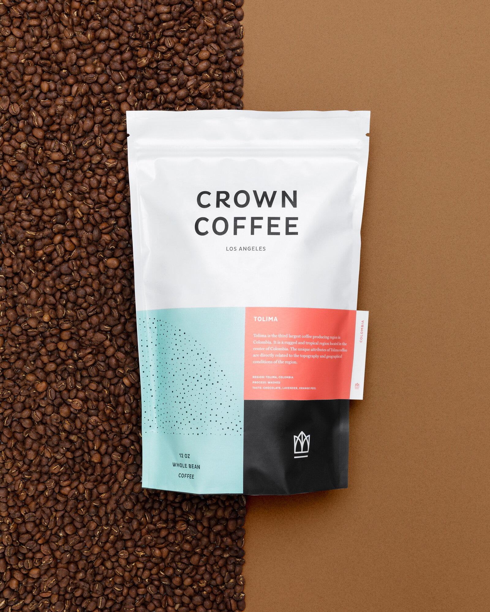
I recently had the chance to photograph this incredible branding and packaging design by Studio Mast for Crown Coffee. With the bright colors and modular design, it was my aim to take these cues and expand upon them with the product photography by using sharp lines and hard splits in color. To play on the packages dotted pattern, developed to mimic the imperfect nature of coffee beans, I incorporated whole beans that add context, texture, and a juxtaposition to the flat bold colors.


